
“Taylor on Sexism, Scrutiny and Standing Up for Herself” Never thought there’d be a worse September Issue than Kendull’s but here we are!
You are using an out of date browser. It may not display this or other websites correctly.
You should upgrade or use an alternative browser.
You should upgrade or use an alternative browser.
BAD Vogue Covers
- Thread starter Twiggy
- Start date


Obviously a model would be asking too much but this is some foolishness.View attachment 59364
“Taylor on Sexism, Scrutiny and Standing Up for Herself” Never thought there’d be a worse September Issue than Kendull’s but here we are!
Photographer: to fire
Stylist: to fire
Art Director: to fire
Anna Wintour (iconic but you’re time has come): to retire and move to Iowa as hermit.
And what the hell is that pose who the hell is she pointing at and mostly: is she still relevant??? (I have zero knowledge about pop music I was left at “shake it off”)
I cannot tell if this was intentional or not but this cover is far too similar to an Uncle Sam poster for my comfortView attachment 59364
“Taylor on Sexism, Scrutiny and Standing Up for Herself” Never thought there’d be a worse September Issue than Kendull’s but here we are!

Obviously a model would be asking too much but this is some foolishness.
Photographer: to fire
Stylist: to fire
Art Director: to fire
Anna Wintour (iconic but you’re time has come): to retire and move to Iowa as hermit.
And what the hell is that pose who the hell is she pointing at and mostly: is she still relevant??? (I have zero knowledge about pop music I was left at “shake it off”)
I cannot tell if this was intentional or not but this cover is far too similar to an Uncle Sam poster for my comfort
View attachment 59369
Yes, it is a direct reference. And the intertextuality is deeper than it may seem. The pose and facial expression is the most obvious link and almost instantly brings the poster to mind (especially in America where patriotism is a big part of the national identity). The colour palette of the cover remains similar to the one of the original poster, too. Taylor's blue suit is a modern female variation of Uncle Sam's which is supposed to symbolize the equality, women empowerment and their independence. The fact that she points with a different hand than the OG may be a twist emphasizing a different gender aka "we (women) are equal to men despite the differences in gender, let us have our voice".
The styling is not accidental, look at her hair. It is a copy of USam's hairstyle (and thus I don't agree the stylist is to blame. It looks shitty on her but it's a pretty successful allusion. So in theory, it's a job well done). The rings are metal and chunky. I bet it, again, is a feminine twist on a Dog tag (the army's "jewellery"). Back to the suit: it's open the same way Sam's is but on the other side (again - details are important). White stripes on Taylor's make it look business-like (equality to men, office jobs + equal salary for women, celebrating the right to vote etc. once more) but still has shoulder pads and looks pretty masculine in a typical fashion sense. Finally, nude nails are coherent with the whole modern-girl-Uncle-Sam look as well.
It's a very American thing to do. Put a celebrity on a SEPTEMBER (let's not forget about that) issue in a patriotic context and call it a day. Do I like the cover? No. But will it sell? Hell yes.

I like your analysis and I agree with the analogy, but I don’t think the average Vogue US reader would have the same thinking process. In my opinion the final result at first sight doesn’t look patriotic. Again, i agree that a September patriotic cover would sell, but it also has to catch the attention.Yes, it is a direct reference. And the intertextuality is deeper than it may seem. The pose and facial expression is the most obvious link and almost instantly brings the poster to mind (especially in America where patriotism is a big part of the national identity). The colour palette of the cover remains similar to the one of the original poster, too. Taylor's blue suit is a modern female variation of Uncle Sam's which is supposed to symbolize the equality, women empowerment and their independence. The fact that she points with a different hand than the OG may be a twist emphasizing a different gender aka "we (women) are equal to men despite the differences in gender, let us have our voice".
The styling is not accidental, look at her hair. It is a copy of USam's hairstyle (and thus I don't agree the stylist is to blame. It looks shitty on her but it's a pretty successful allusion. So in theory, it's a job well done). The rings are metal and chunky. I bet it, again, is a feminine twist on a Dog tag (the army's "jewellery"). Back to the suit: it's open the same way Sam's is but on the other side (again - details are important). White stripes on Taylor's make it look business-like (equality to men, office jobs + equal salary for women, celebrating the right to vote etc. once more) but still has shoulder pads and looks pretty masculine in a typical fashion sense. Finally, nude nails are coherent with the whole modern-girl-Uncle-Sam look as well.
It's a very American thing to do. Put a celebrity on a SEPTEMBER (let's not forget about that) issue in a patriotic context and call it a day. Do I like the cover? No. But will it sell? Hell yes.
The fridge.who the hell is she pointing at

She’s too easy a target for it to be fun, so also providing a contrast for what it could have been
View attachment 71281View attachment 71282
I’ve been fasting for the past 3 days and maybe my brain is a little foggy but...what point are you trying to make here?
I’ve been fasting for the past 3 days and maybe my brain is a little foggy but...what point are you trying to make here?
I think she is trying to show how Taylor's face was slimmer and her features more proeminent and high fashion...
I think she is trying to show how Taylor's face was slimmer and her features more proeminent and high fashion...
Yes that’s exactly right! I wouldn’t say just her face in black and white would make me stop near a magazine stand - looks a bit unsymmetrical to me now and the puffiness detracts from her features - so think it’s a bad Vogue cover. To me it just didn’t hold up well
But to add a bit of value / inspo for someone who is on a fast, I also included an image of her face from <2yrs ago to show how a striking just a black and white face can look - and in this case, the same person can look
Agree with the overall sentiment, but IMO the other b&w pic you posted hardly showcases the features she has hidden under the fat (and that used to be visible). The styling of the cover is actually more forgiving, I think (especially given she's even fatter there); the ultra-sleek yanked-back hair and dark lip are too severe for her already-puffy face in the latter. I propose this instead (from Elle Norway, 2012) for a "what a pity" comparison:
Agree with the overall sentiment, but IMO the other b&w pic you posted hardly showcases the features she has hidden under the fat (and that used to be visible). The styling of the cover is actually more forgiving, I think (especially given she's even fatter there); the ultra-sleek yanked-back hair and dark lip are too severe for her already-puffy face in the latter. I propose this instead (from Elle Norway, 2012) for a "what a pity" comparison:
View attachment 71315
I was originally going to comment and say that she didn’t look too bad on the Vogue cover! At least, compared to how she looks IRL. At least Vogue had the common sense to photoshop her some cheekbones - much better than seeing her moon face on the cover

What the actual hell
I can’t get over how boring these are! I keep seeing people doing the “Vogue challenge” on twitter too and I’m honestly amazed how much better these random people look than the people on actual Vogue covers.
What the actual hell
Vogue outstanded itself giving a hundred mediocre covers in just one month. I get it that we are in hard times, but this is lazy to not even think and execute an okay-ish concept.

Sorry, but if I had to see it then so do you.
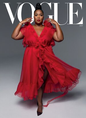
You know the world's gone to pieces when Lizzo is better at posing than Kaia.
The latest US Vogue values covers - love Naomi Osaka's, who this year has really stood up for what she believes in. Frances has made her mark in the feminist space by portraying different types of female characters. But Paloma and Rosalia? I'm sorry but can someone tell me how being big counts as a value?! I would like to see the sales on these but so far I have seen no evidence that plus size covers even sell anymore copies - they are just catering to a very noisy group of people on social media.
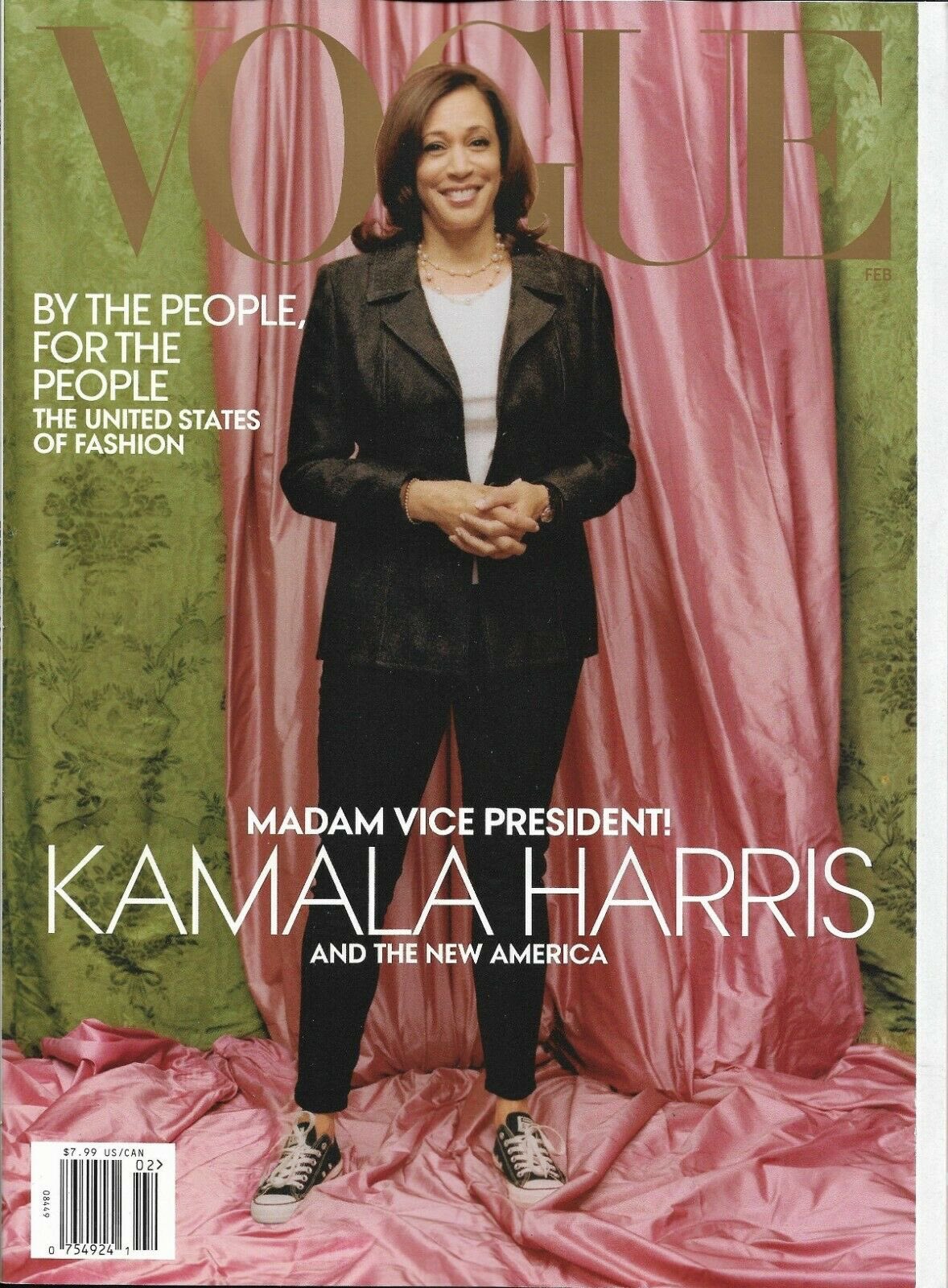


Where's the Biden cover everybody wanted???
 Also lol @ how Michelle Obama got all the VOGUE covers during the Obama administration but Jill Biden won't get any